Project
Customer: Lyrebirds
Year: 2020
Researcher & Designer: Ditte Jørgensen
Year: 2020
Researcher & Designer: Ditte Jørgensen
Deliverables
Brand identity
Website
Logo
Visual identity
Design guidelines
Website
Logo
Visual identity
Design guidelines
Brand Identity
In a digital world, IT security is of great importance.
Lyrebirds is a consultancy company within cyber security, who specialises in discovering vulnerabilities and the prevention of it.
Lyrebirds is a consultancy company within cyber security, who specialises in discovering vulnerabilities and the prevention of it.
Here is defined and created a brand identity that supports the company’s values and communication.
The identity is supported by visual elements and a website.
The identity is supported by visual elements and a website.
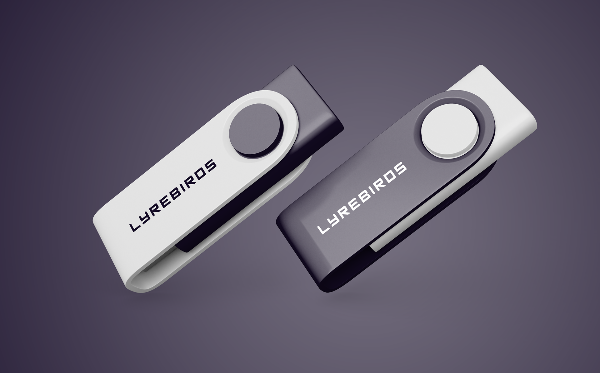
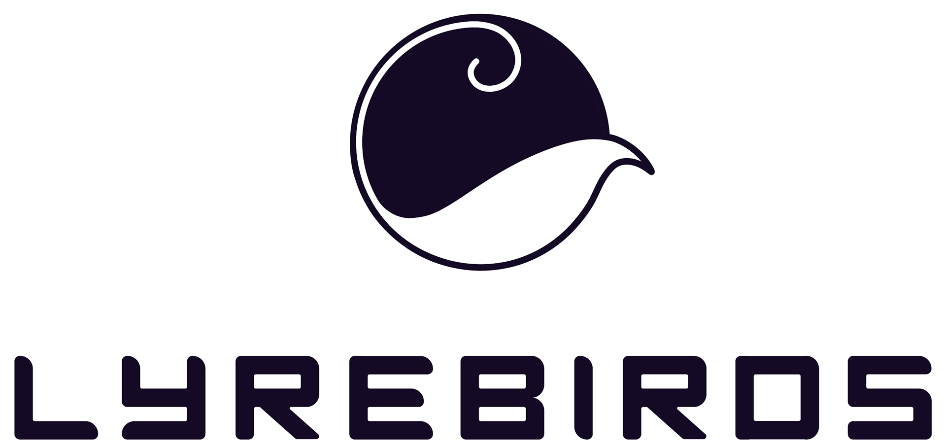
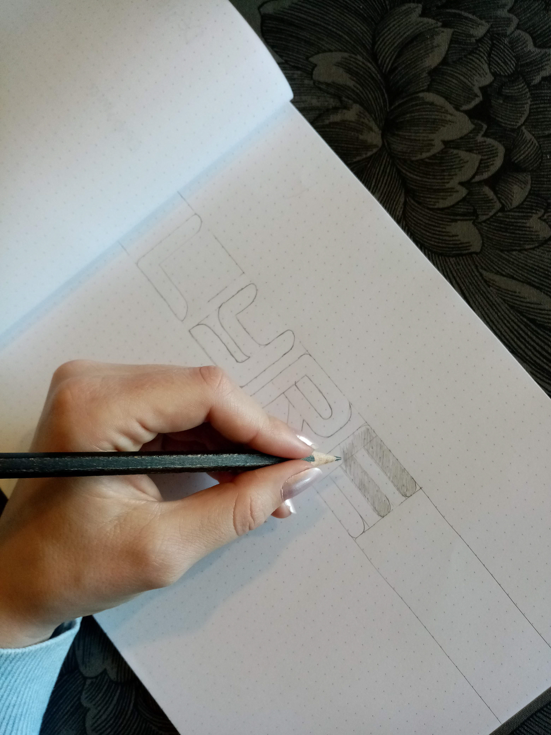
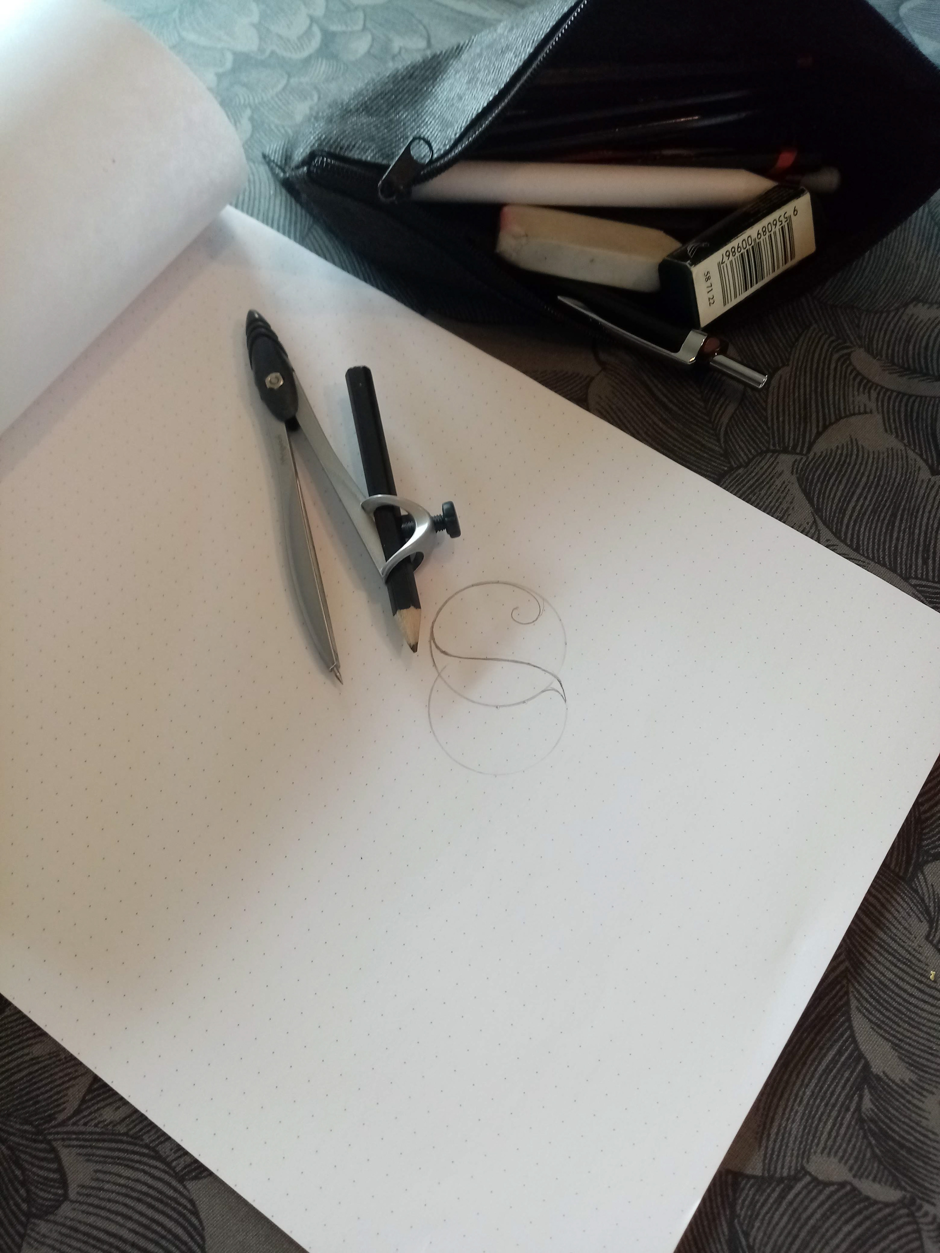
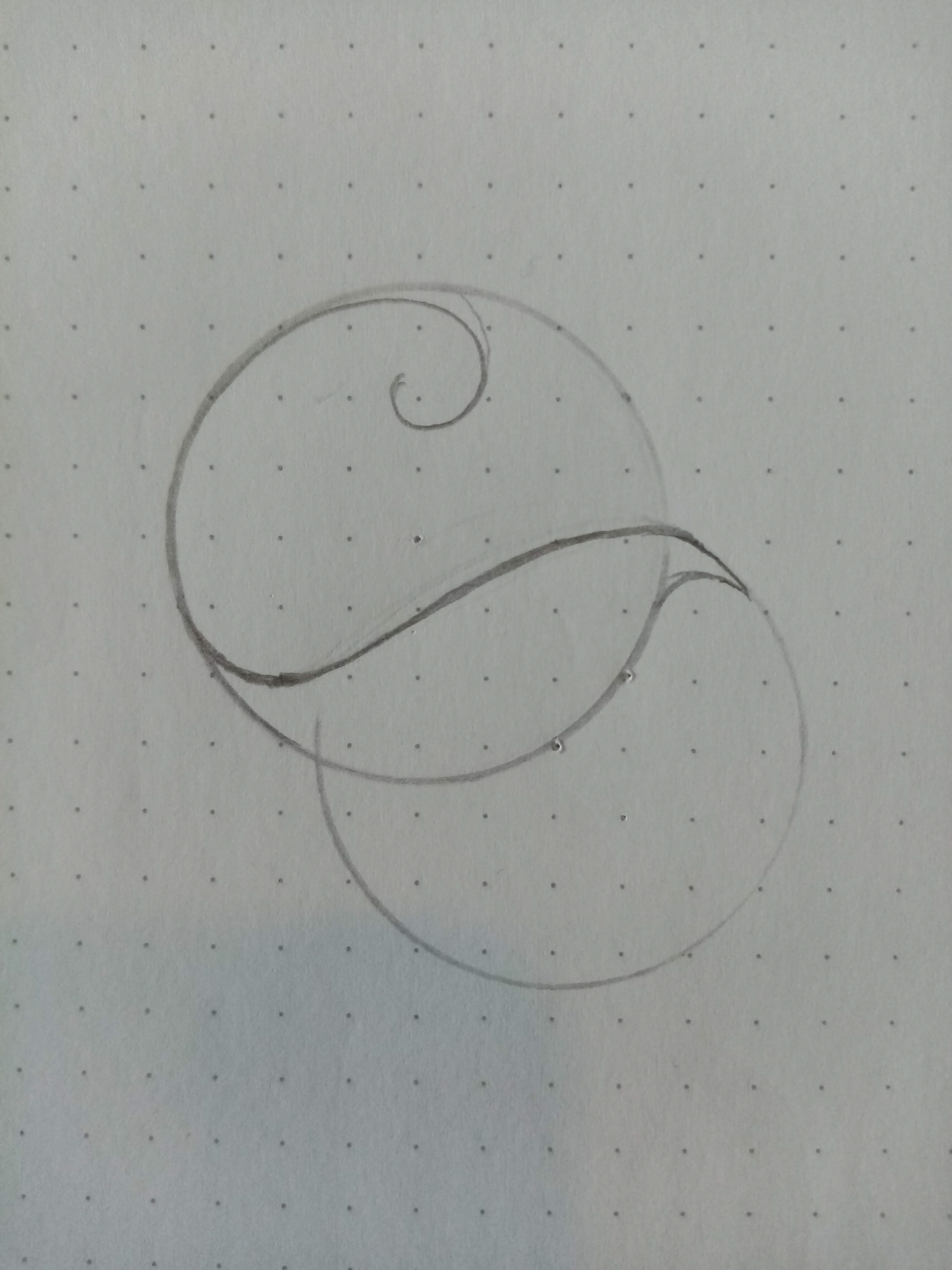
Logo
The logo supports the modern tech feel and consists of a simple brand mark with the silhouette of a lyrebird and a hand drawn, bold logotype with rounded corners and mono spacing.
Flexibility in use has been taken into account.
Flexibility in use has been taken into account.
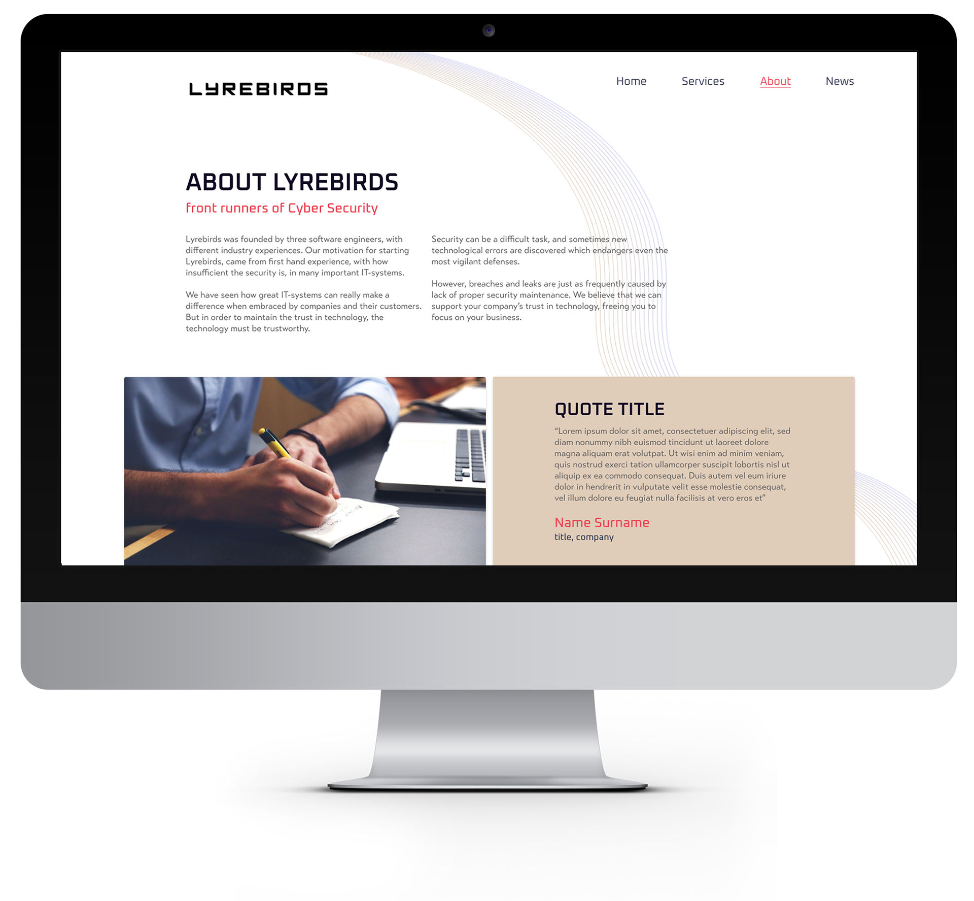
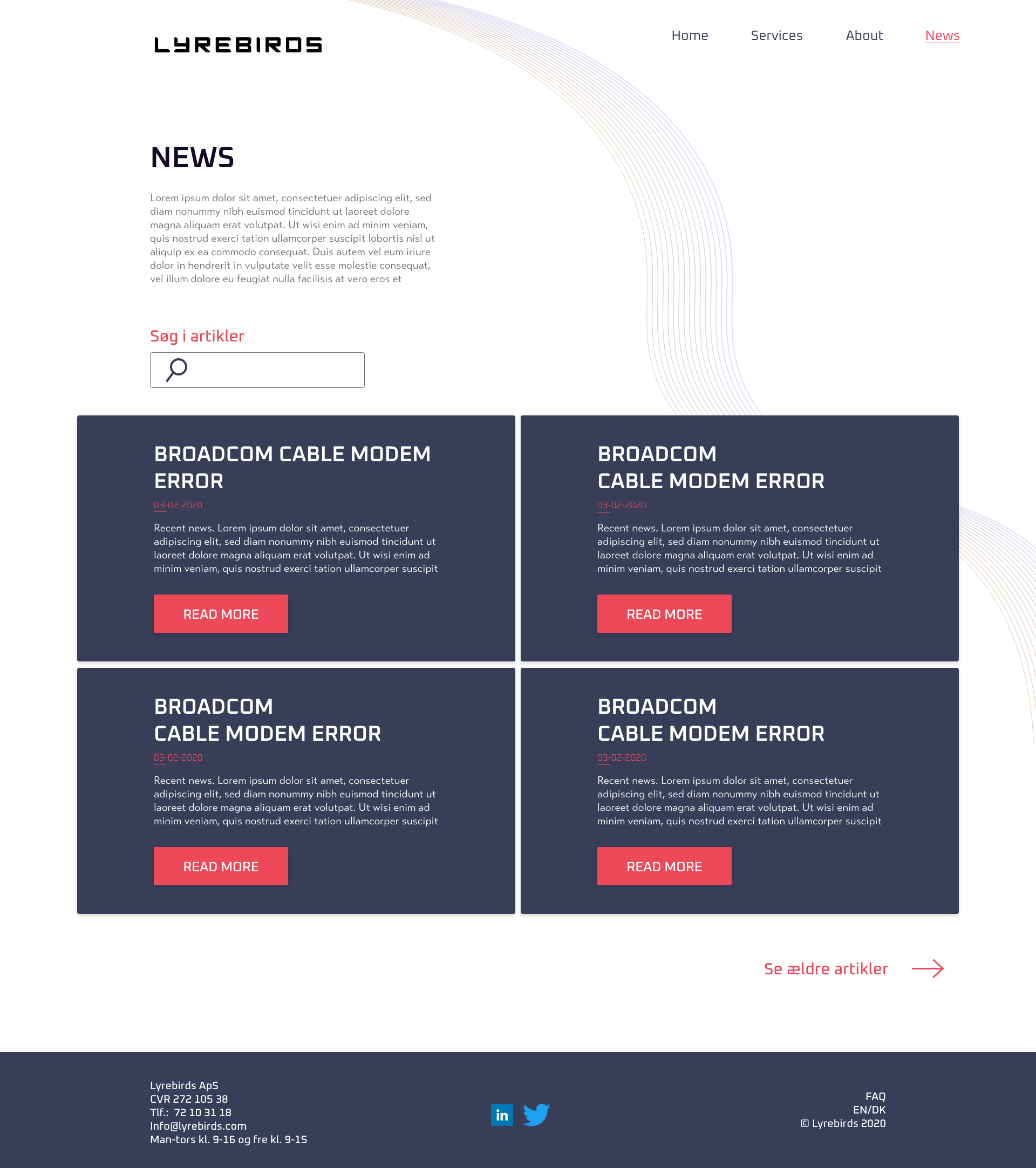
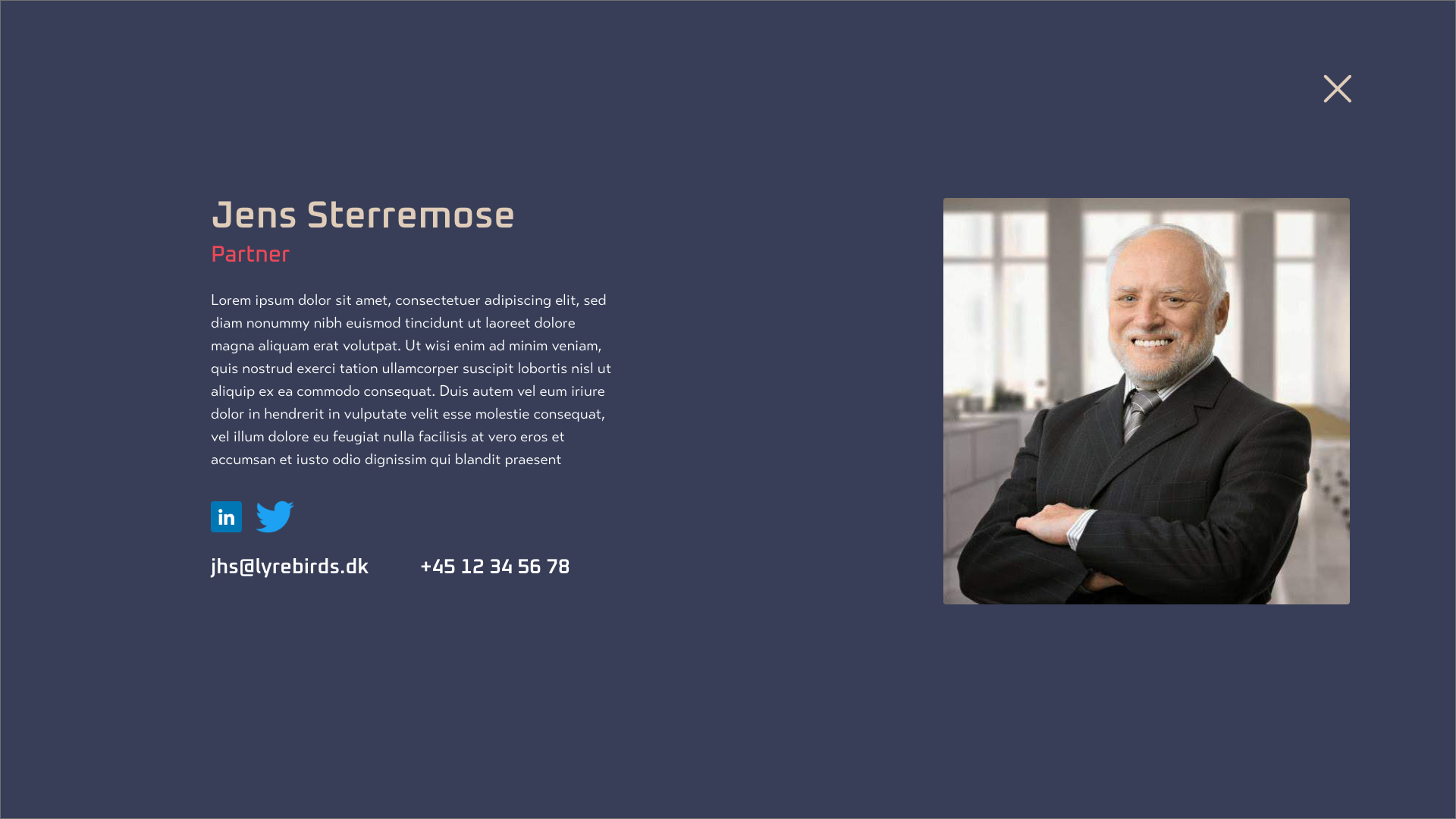
Website
Lyrebirds has two target groups. Potential and current customers and a large fan base who are interested in their activities.
The website addresses these two groups and focuses on communicating news and solutions that are adjusted to fit the customer needs.
The style expresses openness and professionalism and encourage the user to get in touch.
The website addresses these two groups and focuses on communicating news and solutions that are adjusted to fit the customer needs.
The style expresses openness and professionalism and encourage the user to get in touch.
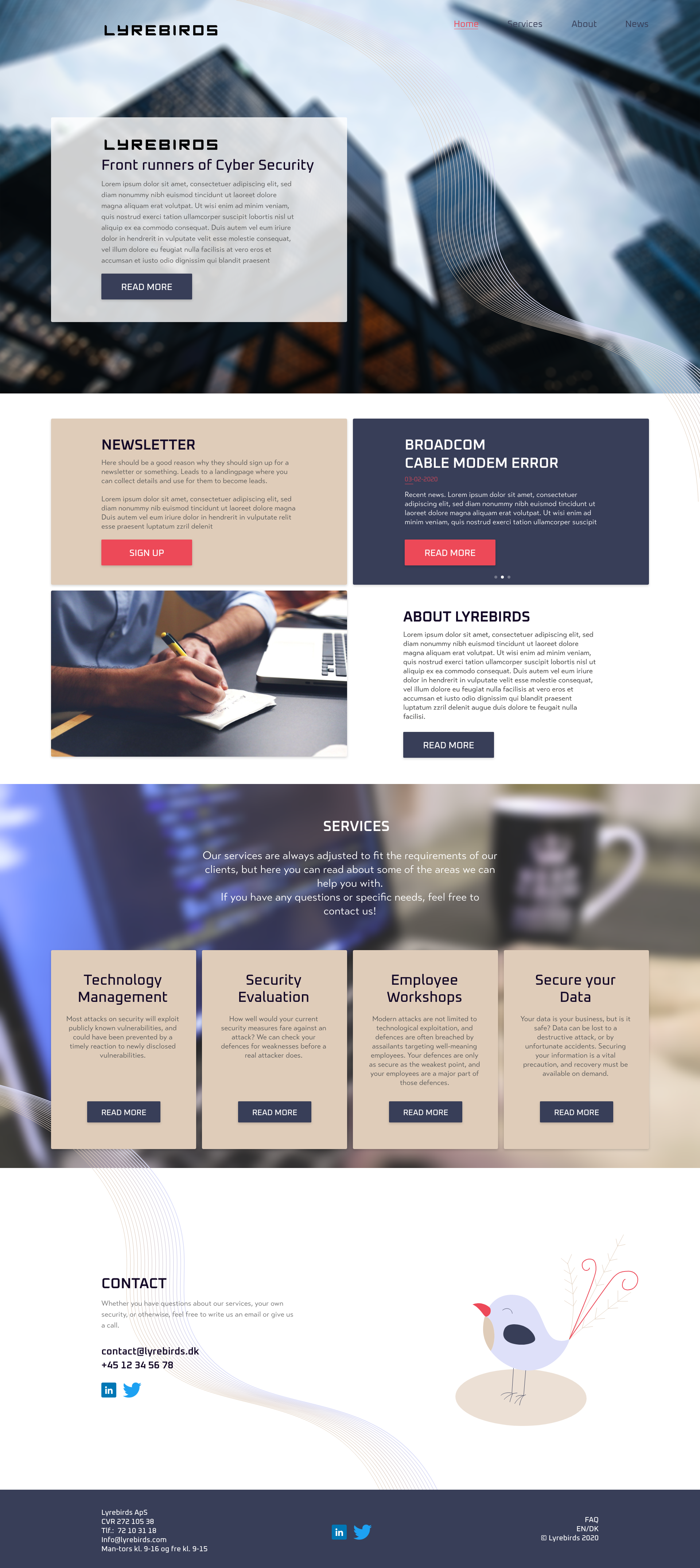
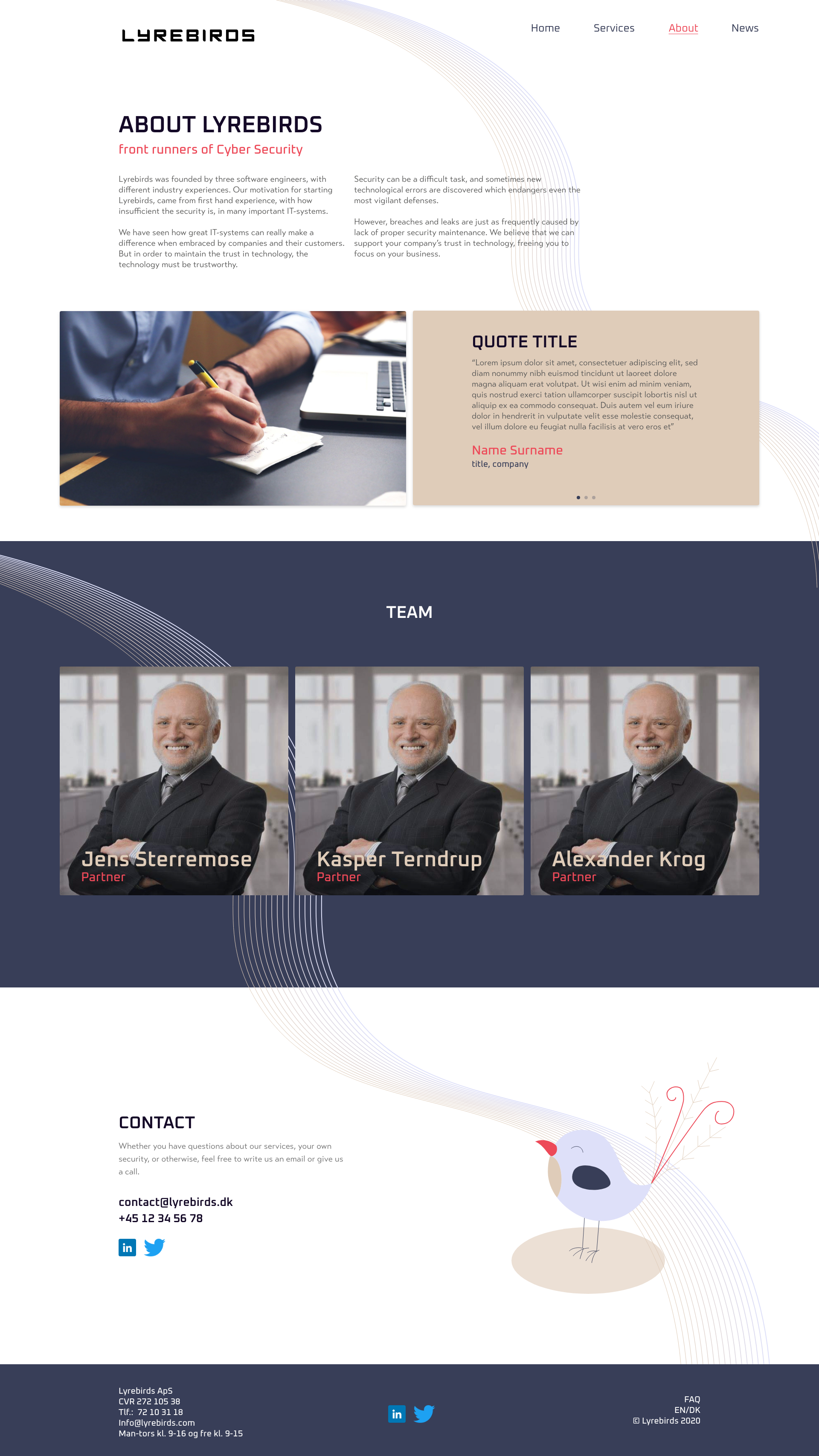
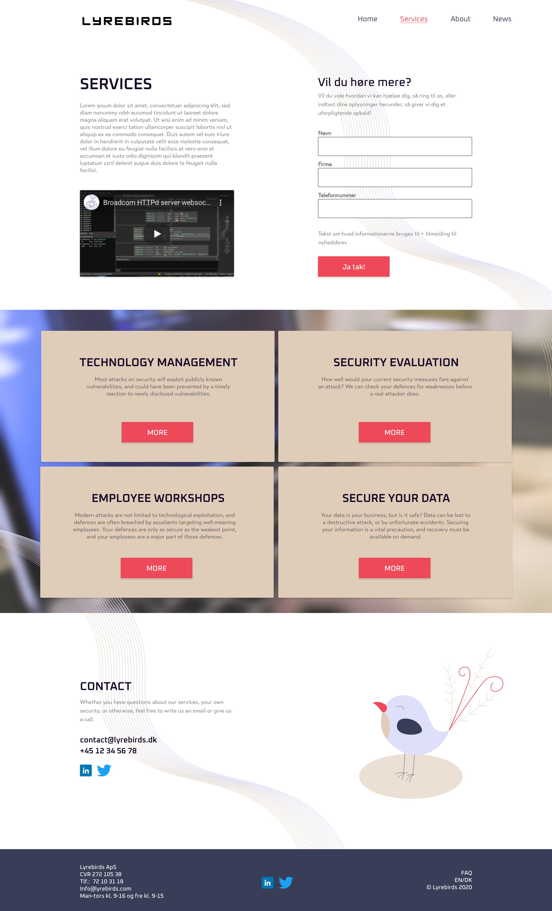
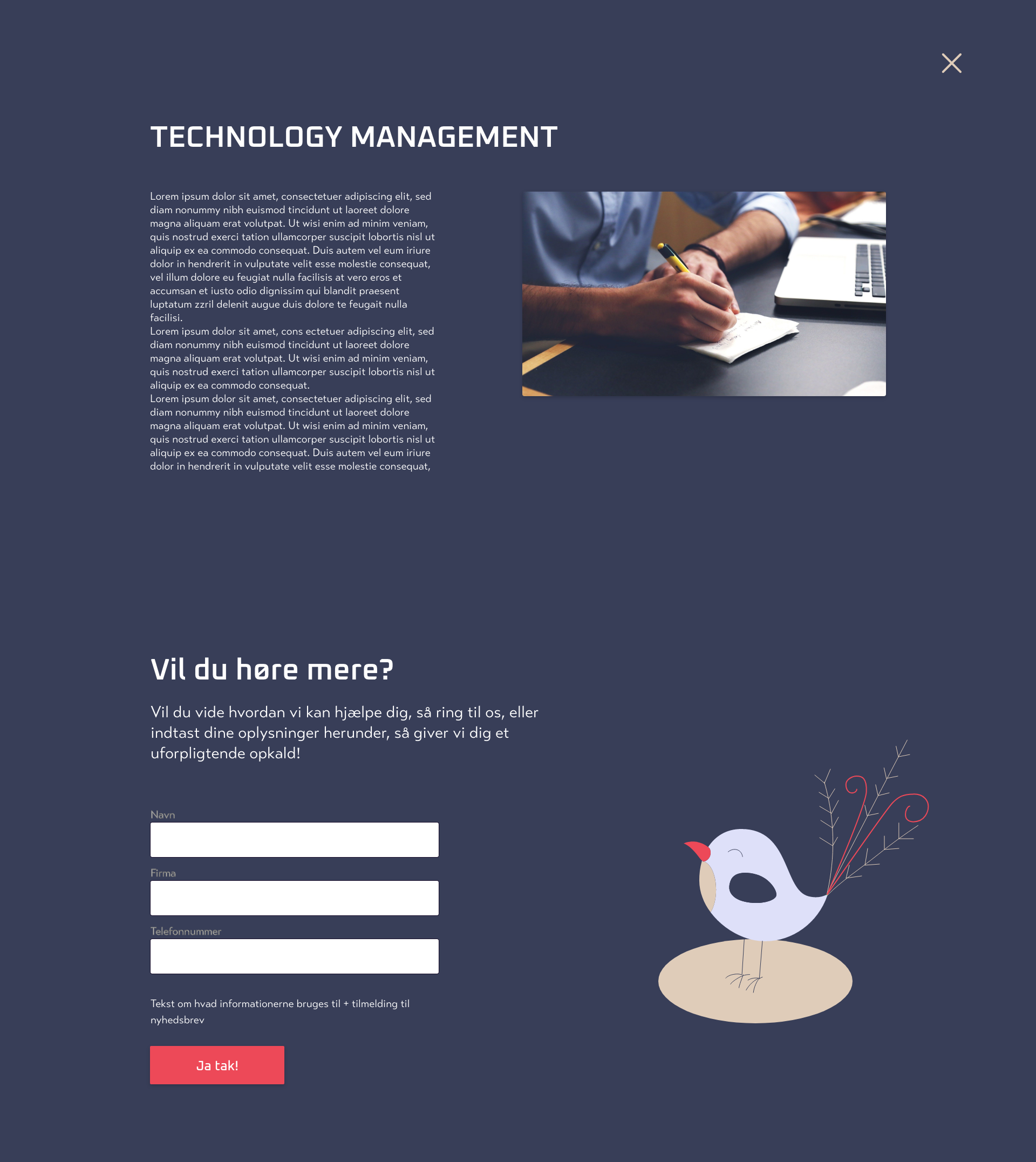
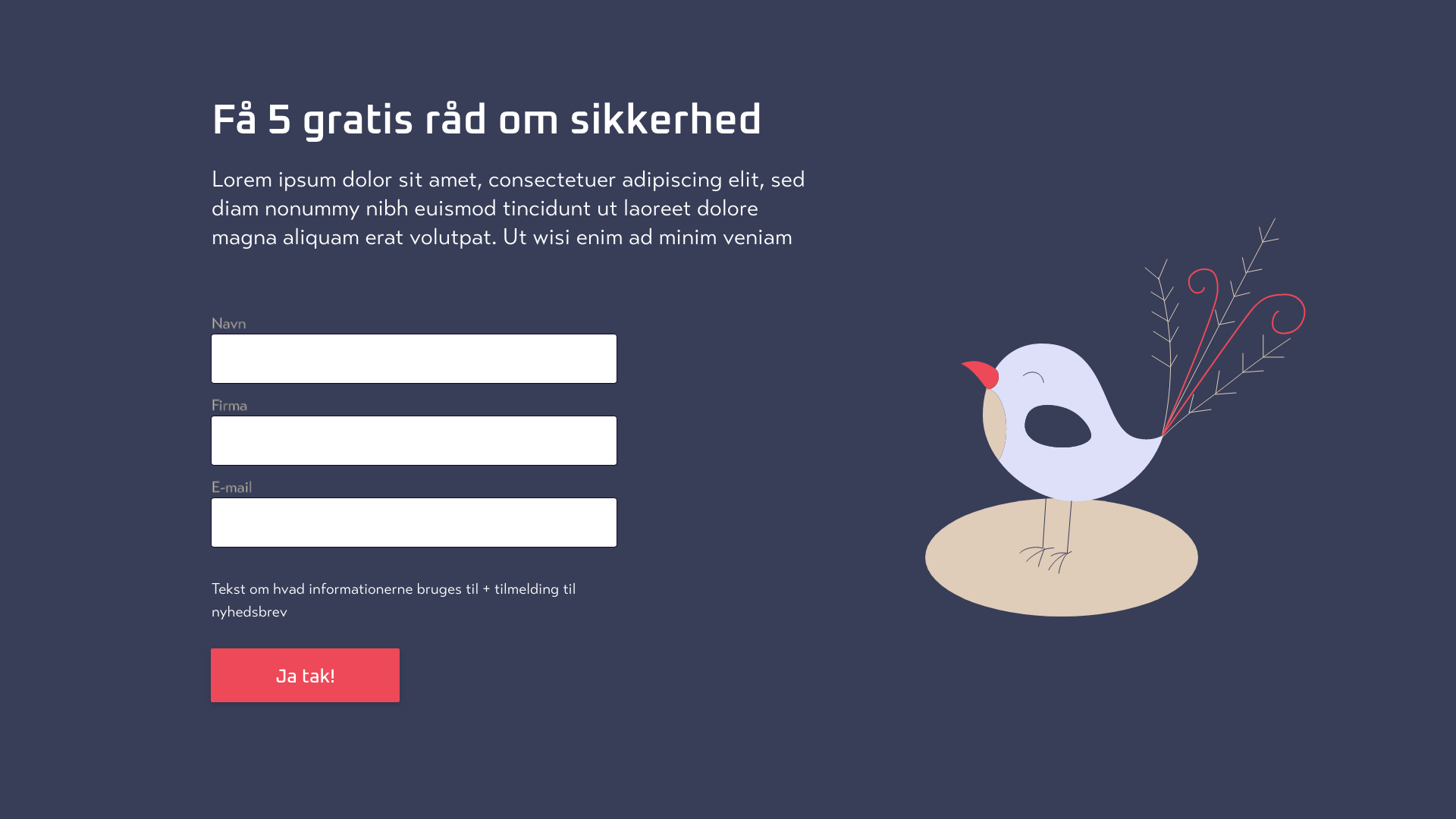
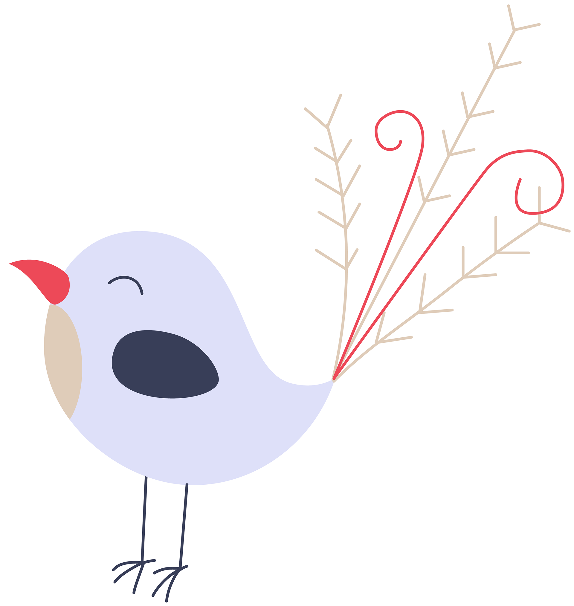
Mascot
The mascot adds an emotional aspect to the identity and ads an informal feel. It connects the company with their surroundings and appeals to the stakeholders. It can be added to different medias, when appropriate.